Fruta
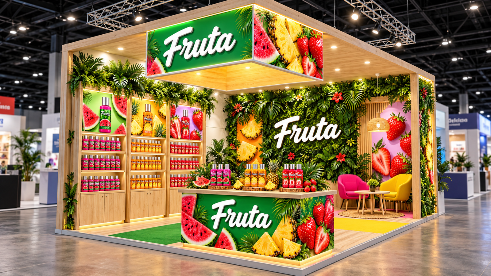
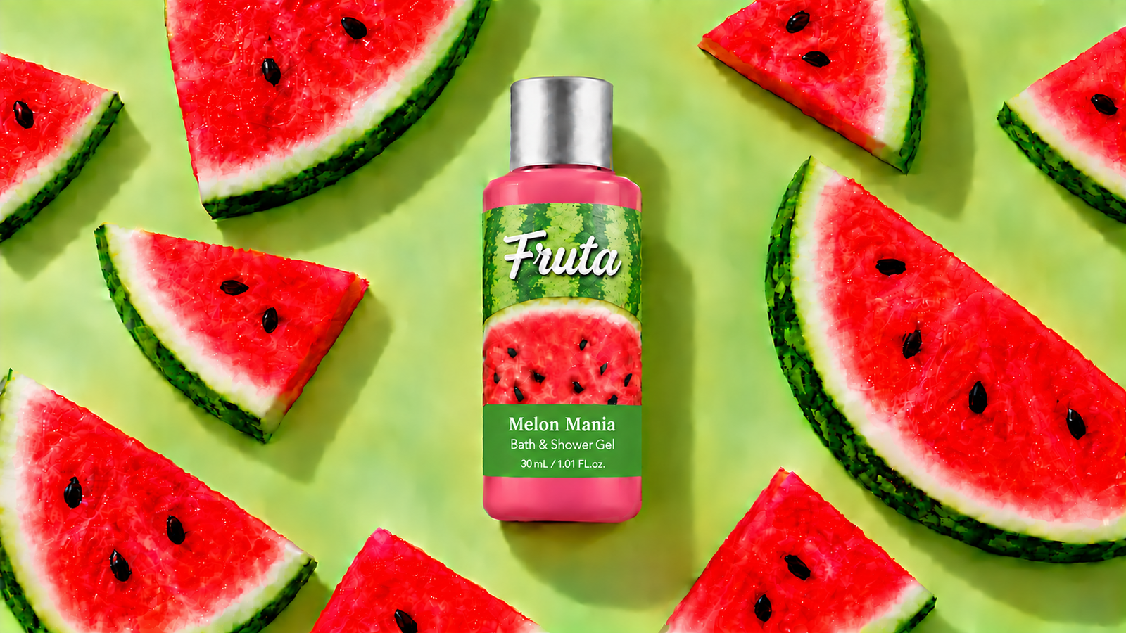
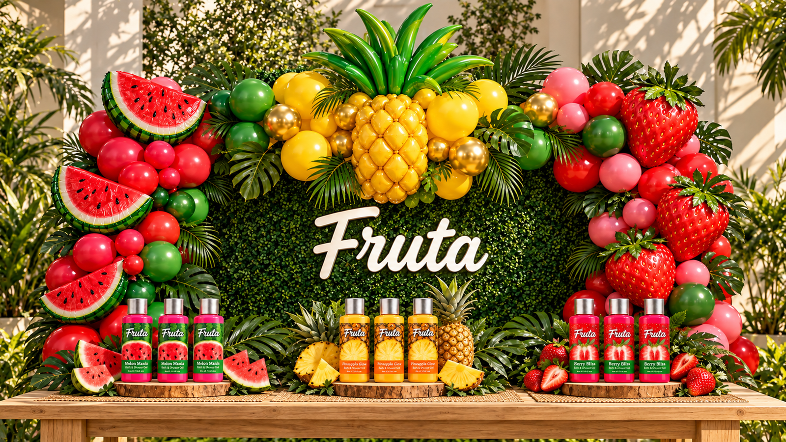
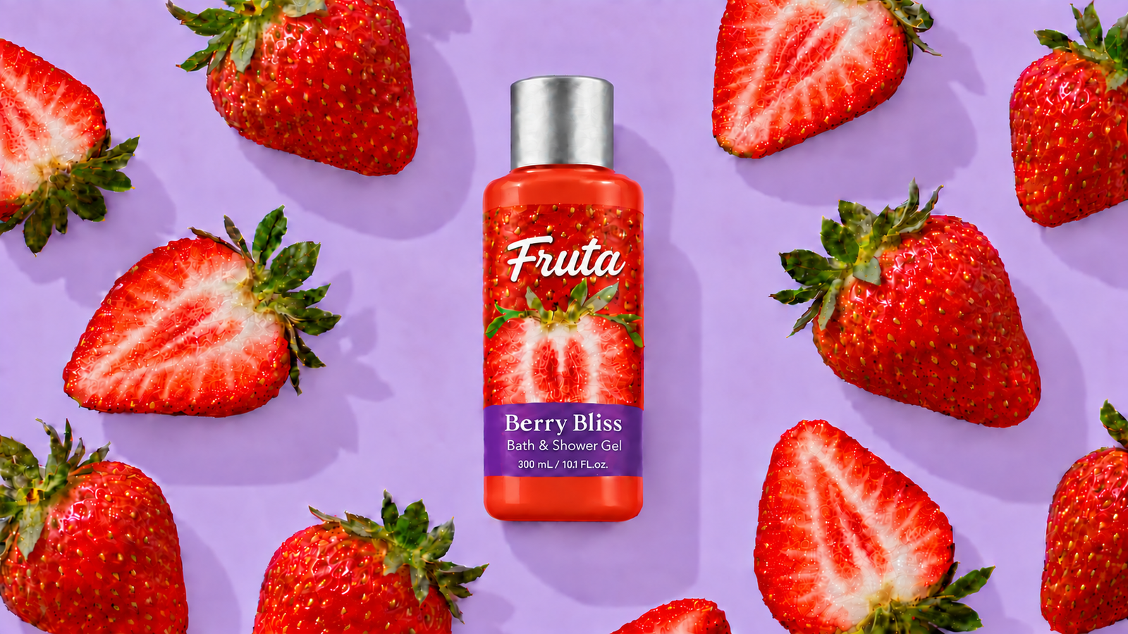
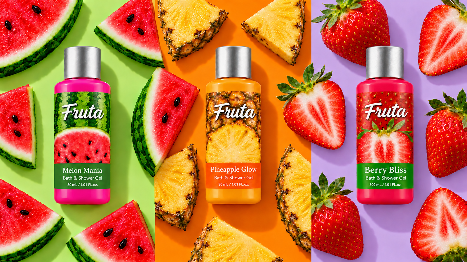
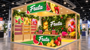
Fruta began with a creative challenge: how do you transform the bold, sensory appeal of fresh fruit into a bath and body brand that feels elevated without losing its sense of fun? I developed a scalable packaging system built around close-up fruit imagery, color-coded products and a consistent label architecture. The fruit communicates each scent immediately and creates strong shelf impact, while the expressive product names add personality and make the collection memorable. Refined typography and a clean visual hierarchy balance the vibrant imagery, increasing the brand’s sense of quality. The final identity communicates freshness, sensory indulgence and joyful self-care through a system that feels cohesive, premium and easy to navigate across the full product range.